Arts & Crafts in Edinburgh
 By StarShark
Comment Box

Like something on my site? Seen a weird typo? Huge fan of my latest blog post? Comment here, I'd love your thoughts and feedback!
Welcome to my Blog!
Making beeswax wraps for the first time
28th September 2023 
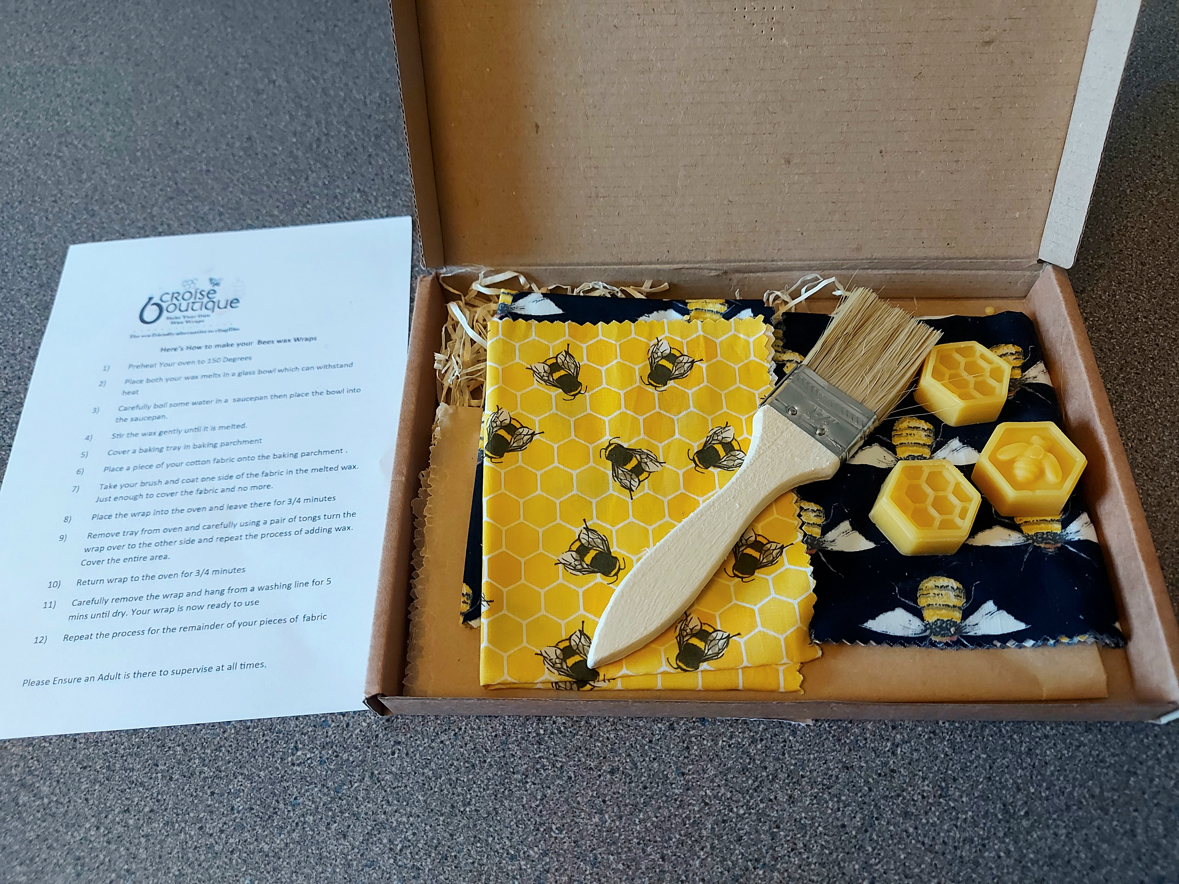
 Hi! This blog post is about a beeswax-wrap making kit a friend gave to me. I've never used beeswax wraps before, let alone made them, so I was very excited to give this a go!


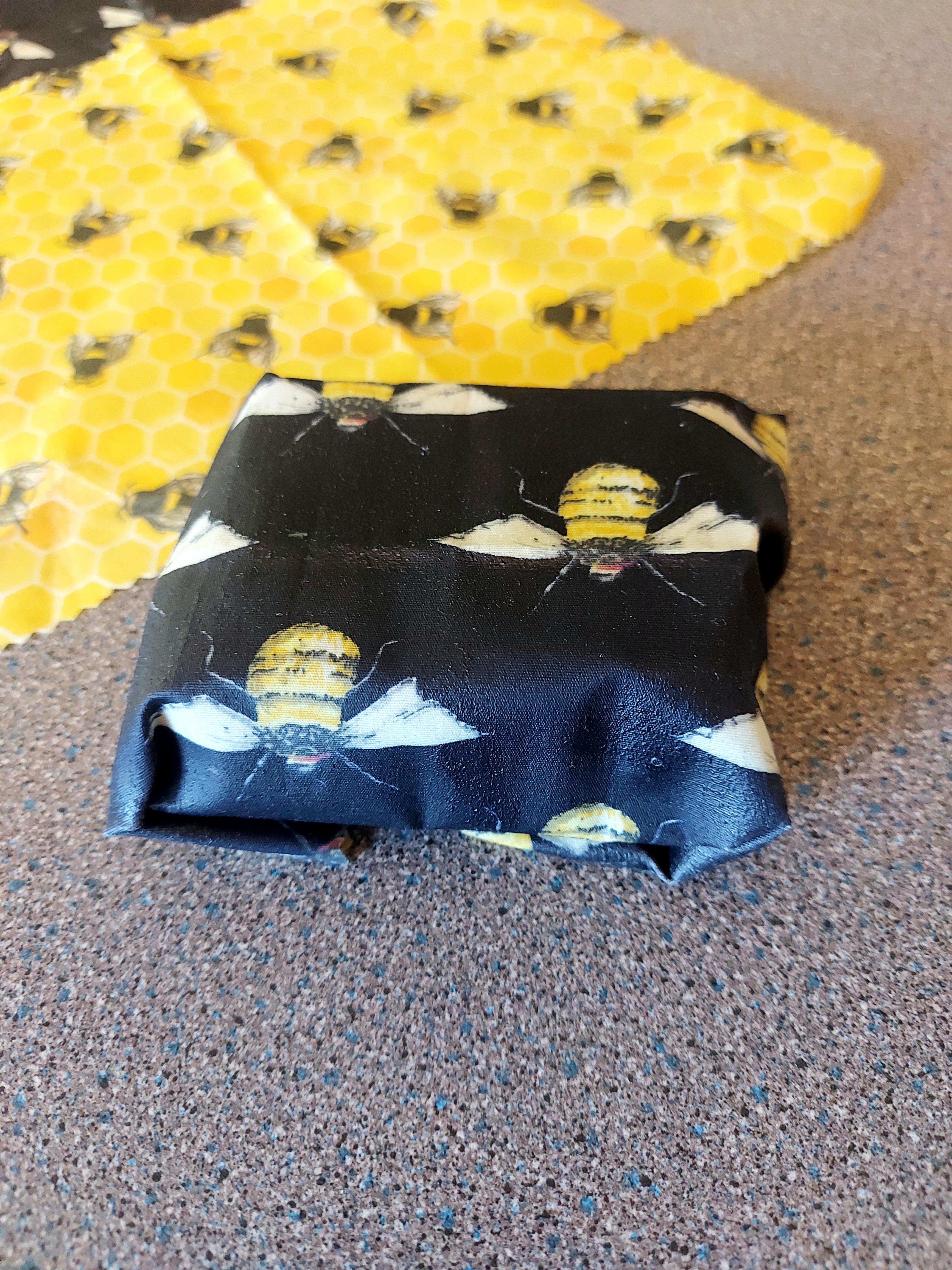
The kit came in a neat little box with pretty much everything needed to make the wraps: cotton fabric sheets, beeswax, baking paper and a brush. I also needed a pan, a heat-safe bowl, and a baking tray.
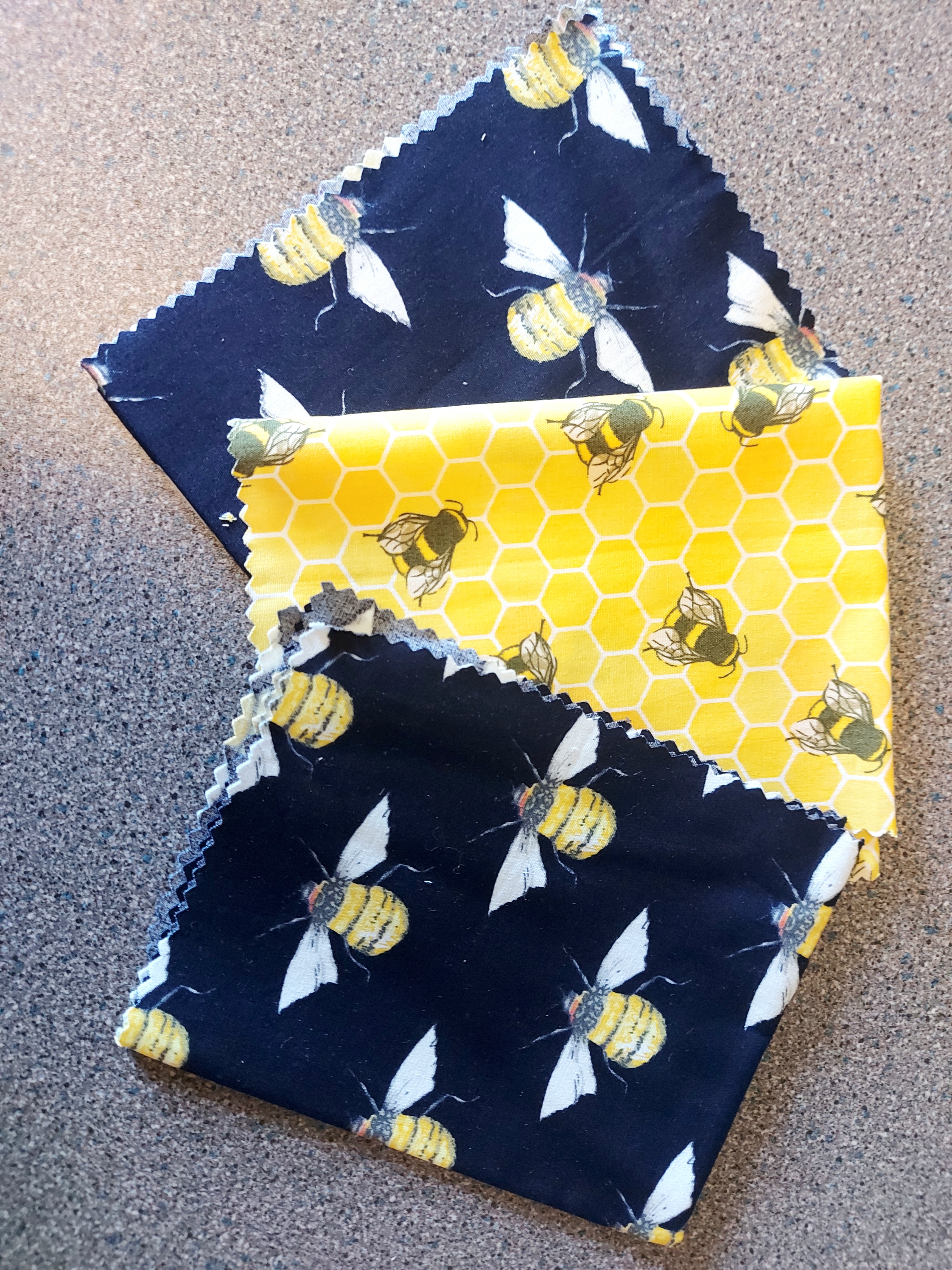
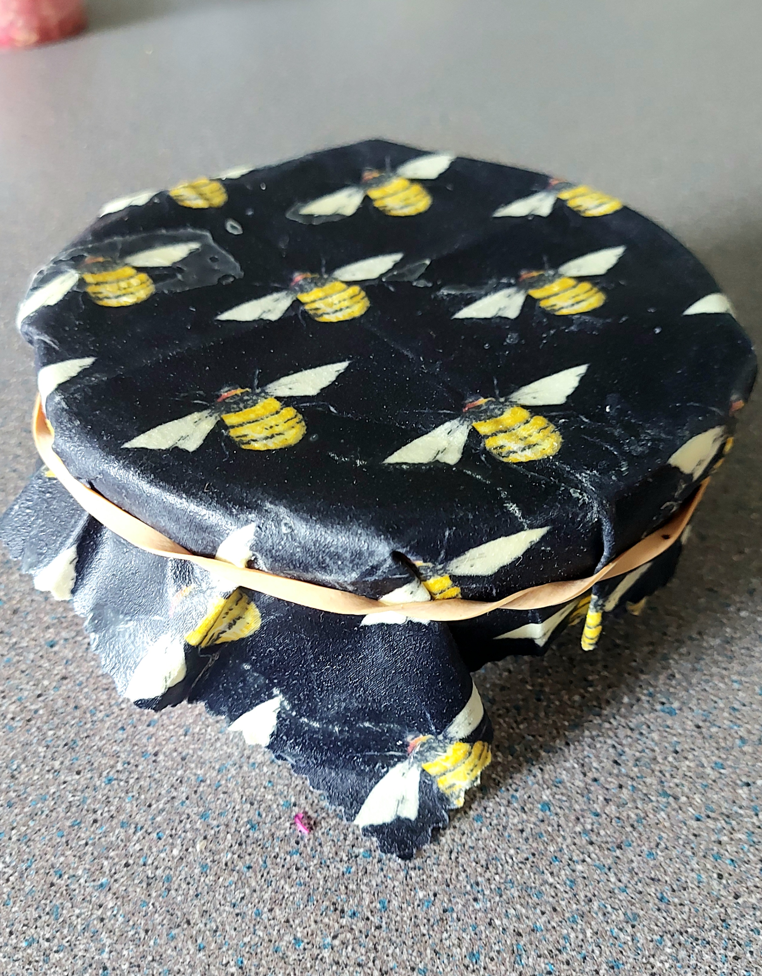
Firstly, the fabric is sooooo cute! I love bees and all bee-adjacent things so I enjoyed the designs. Even the beeswax blocks have a nice design, although these will be melted away.
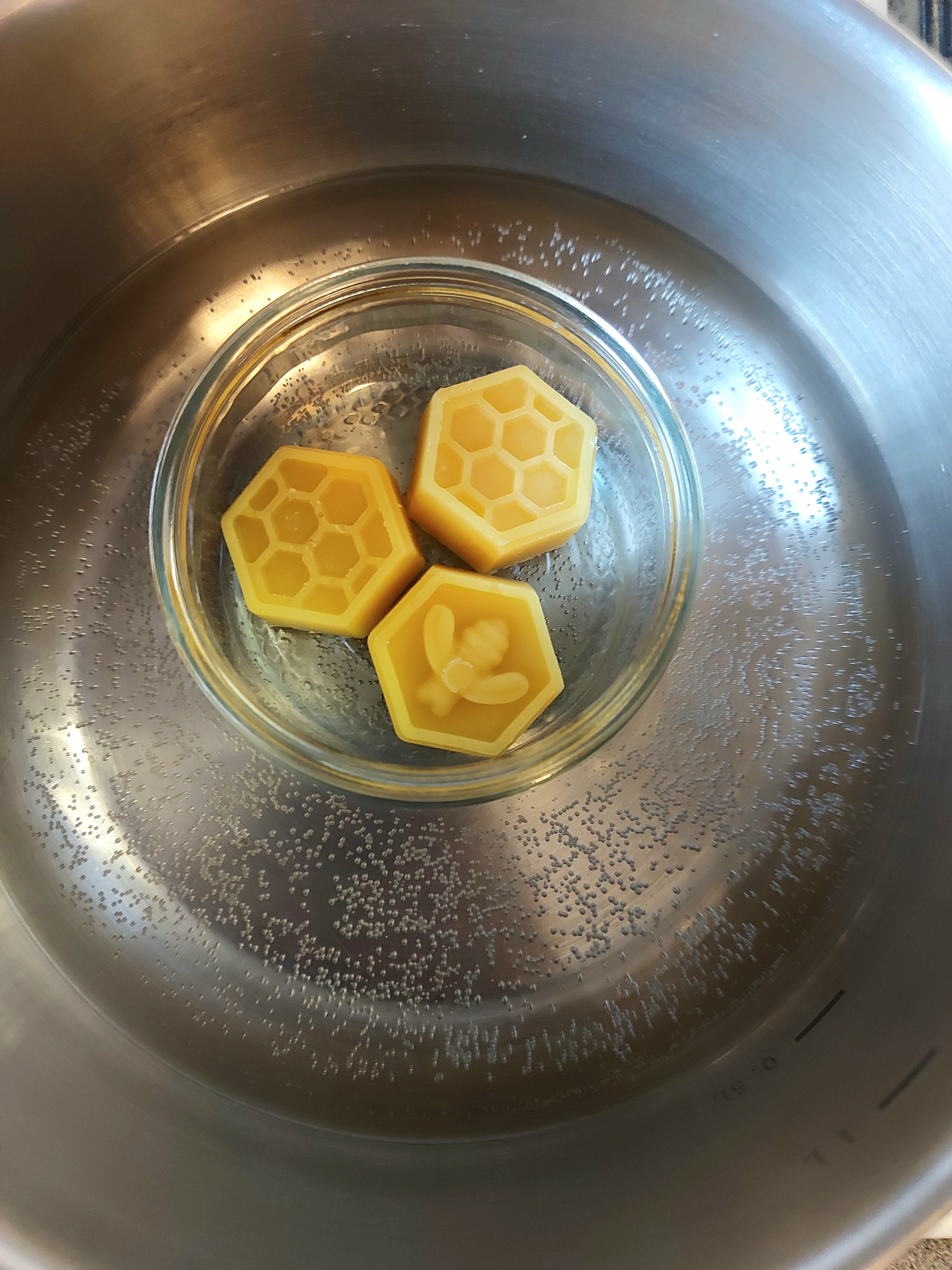
The steps to make the wraps were simple: melt the beeswax by putting it inside a heat-proof bowl in a pot of boiling water; spread the wax on the fabric and put it in the oven for a few minutes to melt, then flip the fabric and repeat; take the waxy fabric out the oven and allow to cool while hanging up. Nice and easy!


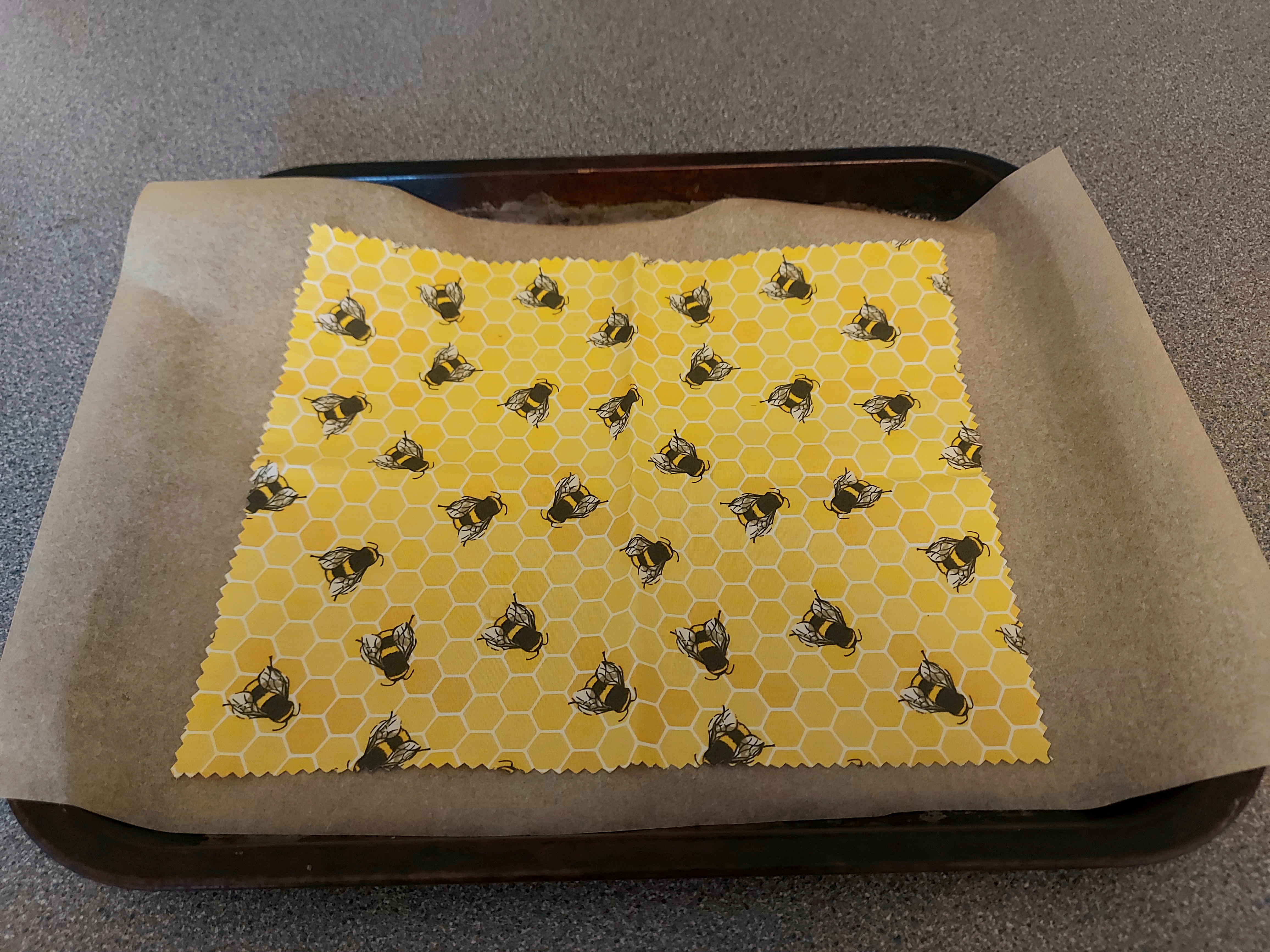
However, I did have some problems. The brush the kit supplied was of really low quality - the bristles started falling out as soon as I used it, and some got caught in the wax! Also, I didn't have anywhere convenient to hang my wraps to cool so I put clothes pegs on the top corners and held them until they were cool, which fortunately was less than 5 minutes.


Overall I think they turned out great! I still need to learn how to best use them, but already this week I have used them to wrap a slice of cake, half an avocado, and a bowl of coleslaw. The friend who gave me the kit uses them to take sandwiches to work every day... I'm usually a soup person so I don't think that will work so well for me, but I'm sure I'll find a million other uses! I would like to make some more wraps and now that I know how I think I can buy all the materials for much, much cheaper than either pre-made beeswax wraps or a kit like this. It was very easy, took less than 30 mins total to make 3 of them... So I think anyone could have a good time making these! Maybe give the kit a miss, though, and just buy the materials yourself...
Stamping and Zines
16th June 2023
Yesterday I went to a great workshop hoested by Coin Operated Press and StampaLoFi... StampaLoFi is such a cool venue in Ocean Terminal! The workshop was great of course, love a little zine time and learning to do mimeography with StampaLoFi was super fun (there's an overview of the process on StampaLoFi's website. Anyway it was all very fun, I've added upcoming workshops with StampaLoFi to the calendar.
Updates
- Added more workshops (infinite task)
- Added zine photos to my gallery
Designing Designs
11th June 2023
Today I added the site design page! It's got the credits to resources I've used building this site, and links to helpful resources.
Updates
- Added site design page!
- Added a shoutbox next to the blog (hello!)
- Tidied up by getting rid of some uneccesary scrollbars
- Added yet more workshops (I think I've exhausted all the sources I know for now)
Web Accessibility
10th June 2023
Ran my website through WAVE Web Accessibility Evaluation Tool, a tool that runs through your page/website looking for accessibility issues, such as not having imge alt texts or poor contrast between colours. Turns out I had a lot to learn! I hadn't paid attention to using headers in order but I understand their importance now, and it also reminded me to put alts in pictures I had forgotten about (like my navigation buttons). Running through these issues made me really tidy up my code. It took me a couple of hours, but I'm glad I've done it! If anyone using a screen reader/other assistive device has any feedback I'd be very glad for your comment in my guestbook :)
Updates
- Added image alts
- Improved accessibility (I hope)
- Made some new paragraph styles to make words pop (and just learned that I don't know how to apply them to lists hmmm...)
- Decided I'm not ready to tackle adding classes just yet. It's on my far-future to-do list.
Bonus Update
08th June 2023
I changed the font on my blog to be my own handwriting! This is amusing for me and I hope it's legible to everyone else! (if it's not I will change it, but sadly)
If you want to make a font of your own handwriting you can do it at Calligraphr! Just make an account and follow their tutorial :)
I am very pleased with myself hehehe
Icons and Alignment!
08th June 2023
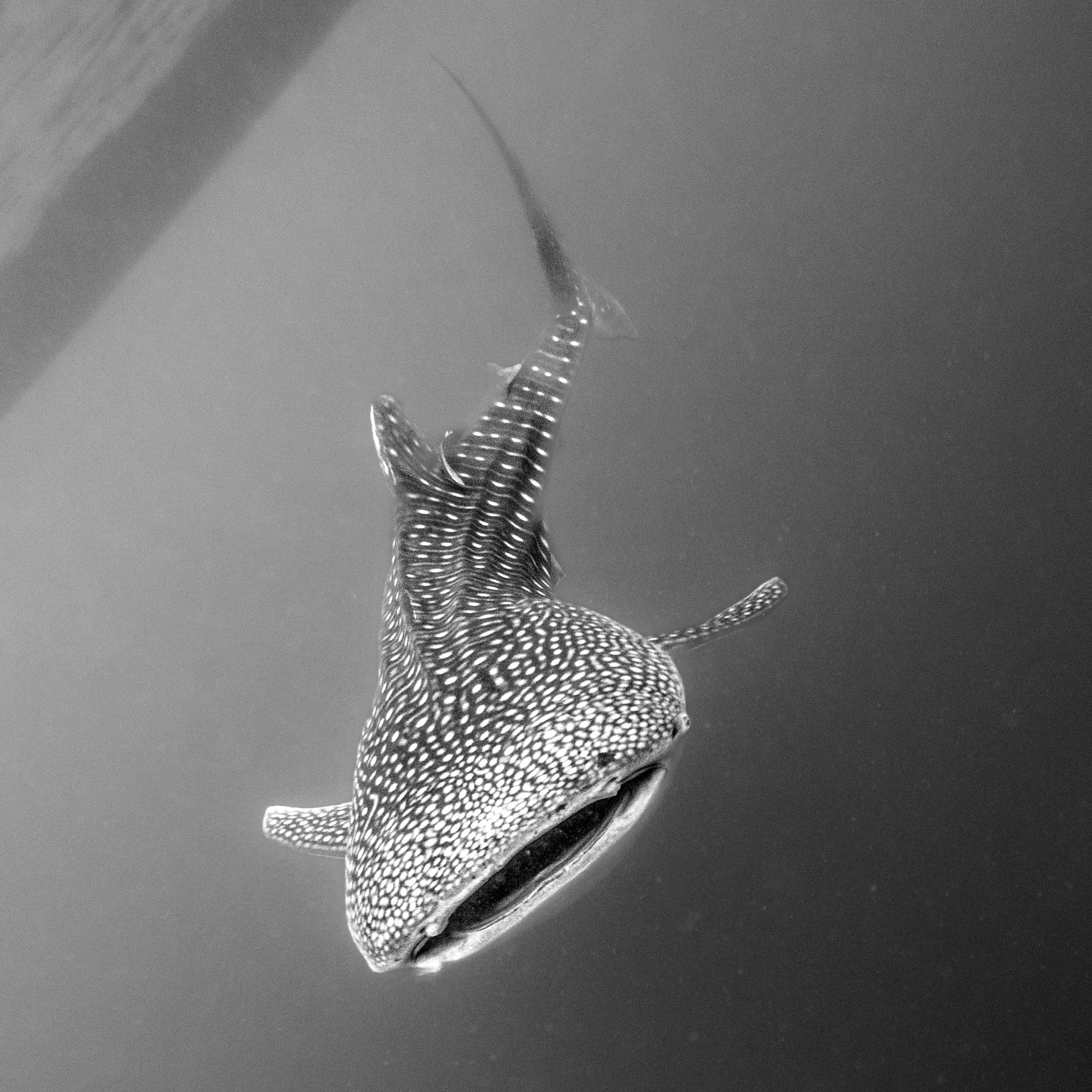
Busy day! (Ok... couple of days, I did some of this yesterday but forgot to write it down oops). I'm really getting into the swing of the aesthetic I want this site to have. I like soft corners, I like readable fonts, I like purple. And I like whale sharks. This site is called StarShark because I think the pattern on the back of whale sharks looks like it could be the night sky and that pleases me.
Updates
- Added icons to my page buttons
- Fixed visual issues by using vertical-align (my new best friend)
- Added more images to my gallery
- Added header
- Fixed header/footer image display issue on mobile/small devices
- Added more workshops
To Do
- Add image alts
- Add in art & craft classes (big job I think, will need a new section)
- FInd away to make the text in my sideboxes look "nicer"... not sure what I want (yet)
What's-on Guide Underway
06th June 2023
I created the 'Calendar' page (probably going to rename it to 'what's on', but I'll see what I end up putting where) and started adding events to it - this site isn't really "done" so I don't think many people will see it yet, but I still like to know what's going on! Looking up workshops reminded me of a class I wanted to book so that was useful.
Updates
- Added calendar/what's on page
Progressing to new pages
05th June 2023
A few more tweaks to the design! Formatting the footer was a pain in the peach: I've sorted it now with float:left but I don't think that's the most efficient solution... however, it will do for now.
I'd like to design some graphics for the footer e.g.,'Click here to make a site', 'Click here to see site credit', 'Click here to give me £500 and a high-five', etc. Will work on that in the future.
Updates
- Started adding and formatting other pages, like this one!
- Worked on my site buttons, they now match my theme and have a shadow and change color when you hover (very cool)
Start Over
04th June 2023
Today I gave up on trying to use pre-made site templates and started redesigning my layour from scratch. The templates are fine, but I want to really customise this space, and now I know what every line of HTML/CSS does and why it's necessary. I've tweaked everything to my preference and I'm really starting to like how it looks.
Updates
- Redesigned the containers and boxes to suit my needs!
- Added Whale Shark section
- Started writing my site manifesto (I want to improve this)
- Optimised site for mobile/small screens (I hope)


